Dollar Shave Club Made the Pink Razor Aisle the Villain of Its Own Launch
Dollar Shave Club CEO Larry Bodner, explaining the company's first women's product line to Adweek this week, said the thing out loud: "I don't need the BS, just give me something that works, and this works. That's a little bit of our voice, none of the BS stuff you don't need, including the pink pastel garbage." Read the sentence twice. He did not describe a razor. He described a shelf.
That distinction is the entire campaign.
The product is normal. The positioning is the interesting part.
The launch itself is competent. Dollar Shave Club's new women's line includes a six-blade razor with a no-slip wavy grip, plus scrubs, balms, oils, butters, and shave aids in scents like cashmere santal. Pricing sits roughly in line with the men's products, which sidesteps the pink tax argument before it starts. Distribution begins on dollarshaveclub.com and Amazon, with Walmart, Target, and CVS rolling out next, according to Adweek's reporting. You could run that exact launch playbook from a spreadsheet template, and most brands would.
What DSC did differently is make the rest of the category the villain. In the 30-second hero spot, a woman walks past boxes labeled "pastel bullshit special" and punches through them. In the AI-generated companion ad, animated razors get tossed into a trash can (with a self-referential joke about OpenAI's Sora thrown in for free). Packaging uses bold reds, oranges, purples, and yellows with vertical copy instead of the horizontal scripty fonts every competitor defaults to. Bodner told Marketing Dive the positioning is "anti-Venus, anti-Billie, anti-Flamingo," which is unusually direct for a category where everyone usually pretends competitors don't exist.
What I keep coming back to is that the brand did not launch into the women's shaving category. They launched against it.
Why this works better than a better product
The women's face razor category is roughly a $1.8 billion market, according to GMinsights' industry report, growing at about 5.4% a year. That is big enough to have entrenched visual codes and small enough that a loud challenger can actually be heard. When a category has been sitting in the same aesthetic for fifteen years (pink, pastel, glitter, script typography), the category itself becomes the opportunity.
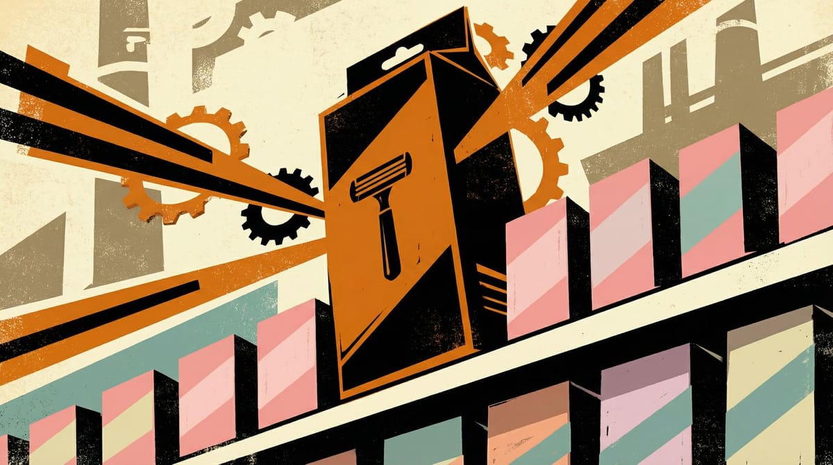
Blade count was never the hook here, and I would argue it is never the hook in shaving. Nobody walks down the razor aisle doing blade-count math. The hook is shelf contrast. On a real Target shelf, a black and orange DSC box surrounded by twelve pink boxes does more work in half a second than any claim about blade geometry could do in thirty.
The same thing is true on Amazon search results. The thumbnail that looks different gets clicked. Every serious category-entry brief should include a shelf audit step where you photograph the top five competitors side by side and ask: what do they all share? If the answer is a color, a font direction, or a visual trope, that is your target. Reject it explicitly. Now you have positioning, not just a product.
This is not a new insight in theory. It is shockingly rare in practice, because most brands chicken out at the category-convention step. They see the pink pastel default, assume it is there for a reason, and match it to play safe. The DSC women's launch is a clean demonstration of the cost of that caution.
The part that usually gets left out
There is a failure mode here that matters, and it is the reason most brands never try it. Rejecting a category trope only works if the customer already resents the trope. If women genuinely like pastel packaging, DSC's pitch collapses. You are fighting customer preference, not lazy marketing.
DSC's bet is that a meaningful slice of the market (probably younger, probably urban, probably already buying men's razors off the top shelf because a boyfriend left one in the shower) is tired of being sold products designed to flatter a visual stereotype that stopped being accurate around 2012. That bet seems reasonable to me, but it is still a bet. The Venus-Billie-Flamingo trio did not become dominant by accident. Some women like the pastel aisle. Those are not DSC's target customers.
The signal DSC gave away for free is the internal data. Roughly 30% of their current customers are already women, and 15% were buying the men's products to use on themselves. That is the research that made this launch defensible. Without that data point, the creative bravado reads as posturing. With it, the bravado reads as a brand finally noticing the audience already in the room.
The playbook, if you want to steal it
If you are entering a category with visually homogeneous competitors, here is the short version.
First, shelf audit. Photograph your five biggest competitors the way a customer would see them. If the packaging feels interchangeable, the category has stopped differentiating on shelf, and there is an opening.
Second, name the trope. Not vaguely ("feminine") but specifically ("pink, pastel, glitter, script fonts, horizontal copy"). Write it down like you are building a list of banned things for your own brand guidelines.
Third, write your positioning as the explicit opposite. If the category is all pastel, your brand is bold colors. If the category is all script, yours is all sans-serif block. If the category's copy is soft and euphemistic, yours is blunt.
Fourth, and this is the one most teams skip: actually say it in the ads. DSC did not just look different. The CEO said the phrase "pink pastel garbage" on the record to a trade publication, knowing it would get quoted. That is the marketing. The packaging is proof.
Fifth, do not try this in a category where customers love the convention. Coffee shop aesthetics, baby products, luxury goods. These categories have conventions customers pay for. Razor packaging is not in that list.
My prediction for the next six months: at least two DTC brands will try this exact "reject the pastel category" move in adjacent segments, probably period care or deodorant. Most will half-ass it. The ones that work will be the ones who had actual customer data backing up the rejection before they made it. Creative bravery without customer research is just a press release nobody asked for.
Why this could only happen after the Unilever split
It is worth remembering that Unilever sold a 65% stake in Dollar Shave Club to Nexus Capital Management in late 2023, seven years after buying the brand for around $1 billion. Bodner has been pretty direct about the era, telling Adweek the company "lost its way" under Unilever's ownership.
A brand owned by a CPG holding company almost certainly does not get approval to say "pink pastel garbage" in trade press. That kind of language goes through legal, gets flagged, gets sanded down, and becomes "we are rethinking the category" or something equally unquotable. There is a real argument that DSC could not have run this campaign under Unilever at all. We wrote recently about Unilever actively deprioritizing brand voice as part of its broader portfolio strategy. The private-equity owners seem to understand that voice was most of what DSC had going for it in the first place.
The founders built the voice. Unilever diluted it. Nexus appears to be letting it off the leash. The women's launch is the first thing that has actually felt like the old DSC in years, and it is not a coincidence that the first thing they did with their freedom was pick a fight with a shelf.
If you run a brand, the question worth sitting with is not whether you would have the confidence to call out a competitor by name. It is whether the visual codes in your category are serving customers or just serving inertia. If the answer is inertia, DSC just handed you a four-step playbook you can run Monday morning.
Notice Me Senpai Editorial