A Dating App Made Signup Deliberately Annoying. Ten Months In, It Looks Like That Was the Right Call.
Every CRO playbook published in the last decade says the same thing: reduce friction. Remove form fields. Minimize clicks. Make onboarding so effortless that users barely notice they've signed up.
Sonder, a London-based dating app launched in June 2025, went the other direction. Their signup process asks users to build a visual mood board. Not pick from a dropdown. Not answer three multiple-choice prompts. Build an entire collage of images that represents who they are, their aesthetic, their interests, their vibe. It's time-consuming. It requires creative thought. By conventional CRO standards, it's a disaster.
According to TechCrunch, it's working.
"It's like Pinterest and Myspace had a baby"
That's how co-founder Mehedi Hassan described the app to SW Londoner. Hassan and his three co-founders (Lenard Pratt, designer Helen Sun, and marketing lead Hannah Kin) all met at Queen Mary's University in London. Three of them still work full-time corporate jobs. They built Sonder after Hassan discovered "date-me docs," those viral Google Docs where people lay out who they are in a completely freeform, unstructured way. That format was generating more genuine interest than any dating app profile he'd seen.
The insight was simple enough: structured prompts produce structured (and boring) responses. Kin told Global Dating Insights that dating app prompts "kind of prime and frame you to have the same conversations with different people." Hassan was more blunt about the competition: "Hinge feels like a common application."
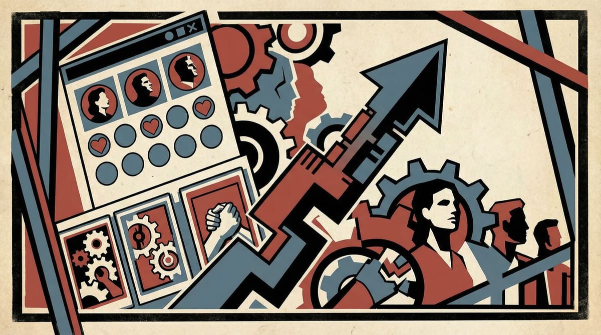
So Sonder's profiles are completely unstructured. Users build what the app calls a "canvas," which is essentially a mood board of images, vibes, and aesthetic cues. The algorithm matches people whose canvases overlap visually and thematically. No paid boosts. No ranking system. No swiping through a stack of nearly identical profiles. And it rewards effort: the more thoughtfully you curate your canvas, the better your matches get, because the algorithm has more signal to work with.
The app is currently iOS only, completely free, and doesn't even have a subscription tier yet.
The CRO heresy: not all friction is damage
There's a concept in behavioral economics that gets cited a lot in academic papers but almost never in actual marketing team standups: effort justification. People value things more when they've invested effort to get them. It's adjacent to the IKEA effect (you love the bookshelf more because you built it), but applied to access rather than ownership.
Sonder's onboarding is essentially a filter. It asks: are you willing to invest 15 to 20 minutes building something creative in exchange for better matches? If yes, you're the kind of user who takes dating seriously. If that sounds like too much work, Tinder is right there.
And that's the part most CRO-focused marketers miss. Friction isn't inherently bad. Friction is a signal. It can mean "this product isn't designed well," but it can also mean "this product is designed for someone who cares." Removing all friction optimizes for volume. But volume and quality aren't the same metric, and optimizing for one often kills the other.
Dating apps are actually the extreme case of this tension. The apps that made signup easiest (Tinder, Bumble) achieved massive user counts and then spent years trying to solve the quality problem those users created. Low-effort onboarding attracted low-effort users, which degraded the experience for everyone, which drove serious daters to alternatives. Hinge's "designed to be deleted" positioning was essentially an admission that the industry's own growth tactics had created the problem it was now trying to fix.
The marketing lesson isn't "make signup harder"
I want to be careful here, because the obvious (and wrong) takeaway is "add friction to your funnel and watch conversion rates drop while you tell yourself it's strategic." That's just cope with better branding.
The real lesson is about alignment. Sonder's friction is aligned with their value proposition. They're promising better matches through deeper self-expression. The onboarding process IS the product demonstration. By the time you've built your canvas, you already understand what the app is and how it works. You've self-selected into the user base the algorithm needs to function well.
Compare that to a typical SaaS onboarding flow where you reduce signup to one click and then spend the next 30 days trying to activate a user who never really understood the product in the first place. Or an ecommerce checkout you've optimized down to three taps, only to see return rates climb because buyers didn't have enough information to make a confident purchase decision.
I've seen this pattern play out more than I expected. The teams that obsess over funnel completion rates often end up with high-volume, low-quality user bases that cost more to retain than they generate in revenue. The math just looks different depending on where you decide to put the friction.
Where this applies if you're not building a dating app
Most brands aren't building dating apps, obviously. But the principle applies anywhere you have a quality problem downstream of an over-optimized funnel.
If your activation rate is high but your 30-day retention is terrible, you might have an onboarding-quality problem, not a product problem. Consider adding a step that requires users to demonstrate intent before they reach the core experience.
If your lead gen forms are capturing volume but sales is complaining about lead quality, the "remove all fields" approach might be generating noise. Sometimes adding a qualifying question (even knowing it will reduce submissions) produces more revenue per lead than it costs in lost volume.
If your content strategy is optimized for pageviews but your email signup rate is flat, you might be attracting the wrong readers. Sonder's approach suggests that content which asks more of the reader (longer reads, interactive elements, community participation) can filter for the audience that actually converts.
We saw a version of this principle with Liquid Death's house giveaway: unconventional tactics that seem inefficient on paper but build the right audience. The mechanism is different (Sonder uses friction, Liquid Death uses absurdity), but both are betting that filtering for engaged users early beats acquiring everyone and sorting later.
My prediction: within 18 months, at least one top-10 dating app will publicly cite "intentional friction" as a retention strategy. Hinge is the obvious candidate. They're already halfway there with their prompt-heavy profiles.
Four founders, three day jobs, and one contrarian bet
Sonder doesn't have a massive user base, at least not one they're sharing publicly. They don't have funding announcements or splashy launch events. They're four people in London, three of whom are building this alongside corporate careers.
But they identified something that several billion-dollar dating apps missed. Not a feature. A principle: the process of creating your profile can be more valuable than the profile itself. Effort is information. And filtering for the right users before they enter your product is almost always cheaper than trying to fix the experience after the wrong ones flood in.
Whether Sonder becomes a big company is genuinely anyone's guess. I have no idea, and I'd be suspicious of anyone who claimed otherwise for a pre-revenue app with a team of four. But the strategic bet they're making, that intentional friction builds a better product, is worth more attention than most "frictionless" growth stories I've read this year.
Sometimes the annoying signup process is the product.