The Best SaaS Pricing Pages All Pull the Same Three Levers
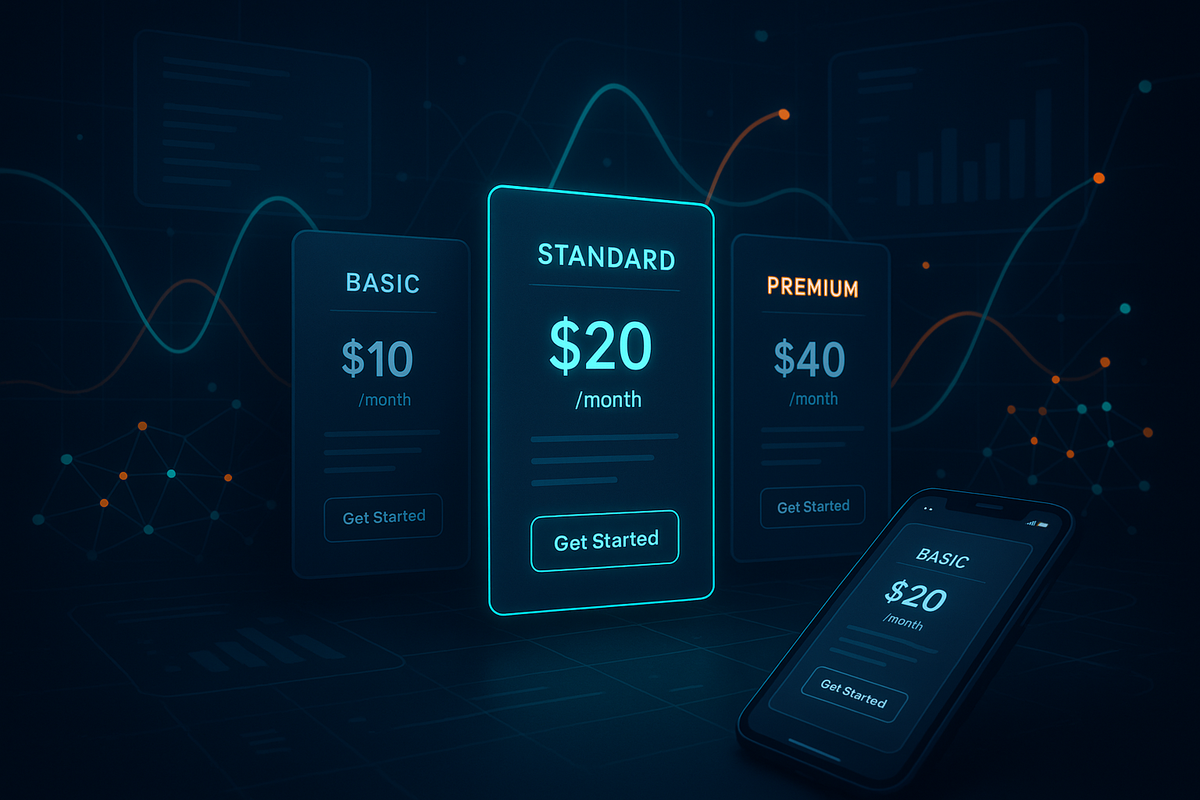
Three-tier pricing pages convert roughly 1.4 times better than two-tier ones, and pages with four or more tiers convert about 31% worse than a clean three-tier layout. The number that decides your signup rate usually isn't the price itself. It's how many options sit next to it, which tier you highlight, and whether the billing toggle is actually pulling its weight. Fix those three before you argue about a dollar figure.
I say this because most pricing-page projects I've watched start at the wrong end. Someone wants to test $49 against $39, or debate whether the Pro plan should be $99 or $89, and three weeks later the conversion rate hasn't moved because the real leak was structural. Design and presentation changes can move conversion 30% to 50% without touching price at all, according to InfluenceFlow's 2026 pricing-page analysis. That's a bigger swing than most price experiments ever produce. So this is the zoom-in: the layout decisions that separate the pages that convert from the ones that just look finished.
Price is the last variable worth testing, not the first
Here's the mistake I see over and over. A team treats the pricing page like a spreadsheet problem when it's mostly a perception problem. The visitor isn't running a cost-benefit model in their head. They're scanning, comparing three boxes, and deciding in a few seconds which one feels like the obvious choice. If nothing feels obvious, they leave to "think about it," which we all know means they're gone.
The evidence backs the perception read. That same 2026 analysis found pages with more whitespace convert about 28% better, because cramming eight tiers of feature rows into a tight grid raises cognitive load and cognitive load kills decisions. Whitespace isn't decoration here. It's the thing that lets a stressed buyer actually process the tradeoff you're offering.
So the sequence I'd run: fix structure, fix the highlighted plan, fix the toggle, fix mobile. Then, only then, test price. Price tests are slow and low-ceiling. You can usually only nudge a number 10% or 20% before it starts feeling wrong to the market, and the lift is modest. Layout has a much higher ceiling and it's cheaper to change. This is roughly the same logic behind fixing the five structural leaks on a landing page before you rewrite the headline. Structure first, copy second, price last.
Three tiers, and the middle one is the entire strategy
The strongest single finding in pricing research is boring and consistent: three tiers wins. Two tiers looks incomplete and gives the visitor nothing to anchor against. Four or more triggers decision paralysis. One 2026 pricing-psychology breakdown put the three-tier lift at about 1.4x over two-tier, and a 31% penalty once you go to four or more. Those are directional numbers, not laboratory-clean benchmarks, and the source is honest about that. But the direction has held across enough studies that I'd treat three as the default and make anyone arguing for four justify it.
The reason three works isn't symmetry. It's anchoring. Your top tier exists mostly to make the middle tier feel reasonable. Show a high number first and every number after it feels smaller by comparison, which is why enterprise-heavy companies put their most expensive plan on the left or top of the table even when almost nobody buys it. The anchor does its job whether or not it ever gets clicked.
Then there's the decoy, which people confuse with anchoring but works differently. The classic proof is Dan Ariely's Economist subscription experiment: when the magazine offered web-only, print-only, and a print-plus-web bundle at the same price as print-only, 84% of people chose the bundle. Remove the "useless" print-only option and that number dropped to 32%. The decoy nobody bought reshaped what everyone else picked. On a SaaS page, a slightly overpriced tier positioned next to your target plan does the same quiet work.
Your middle tier should look like the only sane choice, not the compromise.
The action: audit which plan you're actually pushing. Pick the tier you want most people to buy, give it a subtle "Most Popular" badge, an accent border, or a slightly lifted background, and make sure the tier above it is priced high enough to make the middle one feel like a deal. One documented case had a team cut from five tiers to three, add a popular badge, and watch conversion climb from 1.2% to 3.1% without changing a single price, per the InfluenceFlow writeup. If your page currently highlights nothing, or highlights the cheapest plan, you're leaving the anchor unused. Benchmark to hit: exactly one plan visually emphasized, and it should be your target-margin tier, not your entry tier.
The billing toggle does more work than any other pixel
If I could only change one element on most pricing pages, it'd be the monthly-versus-annual toggle. Adding a clear annual option tends to push annual plan uptake up 25% to 35%, and the reason that matters goes way past the discount. Annual customers churn at something like 5% to 10% a year. Monthly customers churn at 30% to 50% over the same stretch, based on the ranges in that pricing-psychology breakdown. So every visitor you nudge from monthly to annual hands you a retention decision dressed up as a billing preference, not just a bigger upfront payment.
A few things I'd get right on the toggle, because most pages get at least one wrong. Default to annual if your product has any real onboarding curve, since the people who commit annually are usually the ones who'll actually stick around long enough to see value. Show the savings in real dollars, not just a percentage. "Save $240 a year" lands harder than "Save 20%" because the reader doesn't have to do arithmetic to feel the benefit. And label the discount as two free months if the math works out that way, because "two months free" reads as a gift while "17% off" reads as a markdown. Same number, different feeling.
One caveat worth sitting with. Annual defaults can raise refund requests and early-cancel friction if your product doesn't deliver value fast, so this pairs with activation, not against it. If people don't reach their first real outcome in the trial, an annual commitment just front-loads the regret. It's the same tension behind treating activation rate as the funnel metric you're probably ignoring. Push annual, but only once you're confident the product earns the year.
Mobile is where the whole thing quietly falls apart
Roughly 58% of pricing-page traffic is mobile now, per the InfluenceFlow data, which means the majority of your visitors are seeing a version of the page you probably designed second. And the thing that breaks first on mobile is the exact element teams pour the most effort into: the wide feature-comparison table. Five columns of checkmarks that look crisp on a laptop collapse into a horizontally scrolling mess on a phone, and nobody scrolls sideways to compare plans. They just bounce.
The fix is unglamorous. Stack the tiers vertically so each plan is a self-contained card the visitor swipes through top to bottom. Replace the wide checkmark grid with a collapsible feature list or a plan-picker toggle that shows one plan's details at a time. A B2B SaaS company redesigning its pricing tables for mobile-first responsiveness reportedly lifted mobile conversion 34%, according to the A/B testing roundups on pricing. I'd read that specific number as illustrative rather than a promise, but the mechanism is sound: you can't compare what you can't see without scrolling.
Quick gut check you can run in two minutes. Open your own pricing page on your phone, in portrait, and try to pick a plan without pinching, zooming, or scrolling sideways. If you can't do it cleanly, more than half your traffic can't either. Most of the time the fix is a stacking change and killing one table, not a full redesign.
Trust signals belong on the page, not in a separate testimonials tab
People buy pricing on nerves as much as logic. When a visitor is genuinely unsure which plan fits, they look for reassurance that other people like them made the same call, which is why the highest-converting pages I've studied put social proof right on the pricing page instead of hiding it a click away. Customer logos, a specific customer count, a rating, a two-line testimonial from someone in the buyer's segment. These sit next to the tiers because that's the exact moment doubt spikes.
The breakdowns of high-converting pricing pages keep surfacing the same pattern: proof lives beside the decision, not on a different route. If your testimonials live on a separate page, you're asking a hesitant buyer to leave the checkout mindset to go looking for confidence, and most won't come back. Move one strong proof element onto the pricing page this week, ideally something quantified ("used by 4,000 marketing teams" beats "loved by customers"). It's a small change that works on the part of the brain that actually stalls the purchase.
The 30-minute pricing-page audit
None of this needs a redesign cycle or a designer's calendar. Here's the pass I'd run today, in order. Count your tiers, and if it's two or four-plus, that's your first fix toward three. Check whether exactly one plan is visually highlighted, and whether it's the tier you actually want people to buy. Confirm your annual toggle exists, defaults sensibly, and shows savings in dollars. Open the page on your phone and try to pick a plan without scrolling sideways. Find your strongest piece of proof and drag it onto the page next to the tiers.
That's five checks, maybe half an hour, zero price changes. In my experience the biggest wins hide in the first two, because tier count and the highlighted plan are the levers almost nobody revisits once the page ships. Teams treat the pricing page as done the day it goes live, and then it sits there under-converting for two years while everyone argues about the roadmap.
The pages that win aren't the ones with the cleverest prices. They're the ones where a tired buyer on a phone can look at three options, feel one of them light up as the obvious pick, and commit before the doubt has time to arrive.
Common questions
How many pricing tiers should a SaaS page have? Three is the reliable default. Two tends to convert around 1.4x worse because it gives buyers nothing to anchor against, and four or more carries roughly a 31% penalty from decision paralysis. If you think you need a fourth tier, that's usually a sign your enterprise offer belongs behind a "Contact us" button, not a fourth price box.
Should the annual plan be the default selection? Default to annual if your product delivers value quickly and has any onboarding curve, since annual customers churn far less (roughly 5% to 10% a year versus 30% to 50% for monthly). If people don't hit their first real outcome during the trial, hold off, because an annual default just front-loads cancellations and refunds.
Does changing the price move conversion more than changing the layout? Usually not. Presentation and structure changes can shift conversion 30% to 50% with no price change, while price tests tend to have a lower ceiling and slower feedback. Fix structure, the highlighted plan, the toggle, and mobile first. Test price once those are clean.
Notice Me Senpai Editorial