When Making Signup Harder Actually Raises Retention
Adding friction to signup almost always lowers conversion, yet it can still raise retention. When GrowthMentor made a Typeform mandatory before granting access, top-of-funnel conversion fell more than 80%, from above 25% toward 5%, but the users who pushed through activated at a far higher rate. The rule: friction that filters or commits pays off, friction that just taxes users never does.
Most growth teams treat signup friction as a single dial to turn down. Fewer fields, fewer steps, fewer decisions, ship it. And for a lot of products that instinct is correct. But retention is a different problem than signup, and the two are often in tension. A funnel optimized purely for signup volume is very good at manufacturing accounts that never come back. So the real question is not "how do I remove friction," it's "which kind of friction am I looking at, and what is it doing to the users who make it past it."
Good friction filters or commits. Bad friction just taxes.
Here is the distinction I keep coming back to. Friction is worth adding when it does one of two jobs: it screens out people who were never going to stick, or it pulls a small commitment out of the people who will. Everything else is drag.
Product-led growth writers frame the useful version as friction that directs, personalizes, or delights: steps that push the user to the next action, tailor the experience to who they are, or build a little excitement about what the product is going to do for them. Canva is the clean example, asking whether you're a student, a teacher, or a small business, then reshaping the whole dashboard around that one answer. Notice what those have in common. None of them are extra work for its own sake. Each one either teaches the algorithm something about the user or teaches the user something about the product. The friction is doing work. It's not just standing in the doorway collecting a toll.
Bad friction is the toll. Confirm your email, then re-log in, then dismiss three tooltips, then pick a plan before you've seen a single screen of the actual product. That's the kind that shows up in every "reduce onboarding drop-off" post, and for good reason. It lowers conversion and does nothing for the users who survive it. If I had to compress the whole topic into one sentence: good friction changes who gets through, bad friction just thins the crowd without changing its composition.
The credit-card wall is the cleanest example we have
Nothing illustrates the filter effect better than the "credit card up front" debate, because the numbers are unusually clean. Appcues puts opt-in trials, the no-card kind, at a free-to-paid conversion rate of 8 to 25%. Opt-out trials, where you enter a card to start, land at 50 to 75%. That is not a rounding difference. The card requirement roughly triples the rate at which a trial turns into a paying customer.
The catch, and it's a real one, is that the card wall also shrinks the top of the funnel hard. Analyses like Monetizely's put the deterrence as high as a majority of would-be trial users walking away when you ask for payment details before they've touched the product. So you're trading raw signup count for signup quality, and whether that trade is smart depends almost entirely on one variable: how long it takes a new user to hit real value.
From what I've seen, the heuristic that holds up is this. If your product delivers its "aha" fast, inside the first session, no-card usually wins, because volume plus a quick payoff converts enough of the crowd to beat the filter. If activation takes several days of repeated use, the card up front tends to win, because you'd rather have twenty people who signaled intent than two hundred tourists you now have to chase with lifecycle emails. Benchmark to run before you decide: pull your trial cohort and measure median days-to-first-core-action. Under a day, lean frictionless. Three days or more, the card wall is probably leaving money on the table by being absent.
One caveat worth saying out loud. The card wall is a blunt instrument. It filters for willingness to pay, which is correlated with retention but not the same thing. Plenty of serious evaluators bounce off it too, especially in bottoms-up B2B where the person trialing isn't the person with the company card. So it's a lever, not a law.
Commitment friction: make them bet on themselves
The second category is the more interesting one, because it barely costs conversion at all when it's built right. Instead of screening people out, it asks the ones who stay to put a small chip on the table. Behavioral economists call these commitment devices. Users call them "the part where the app asked me to promise something."
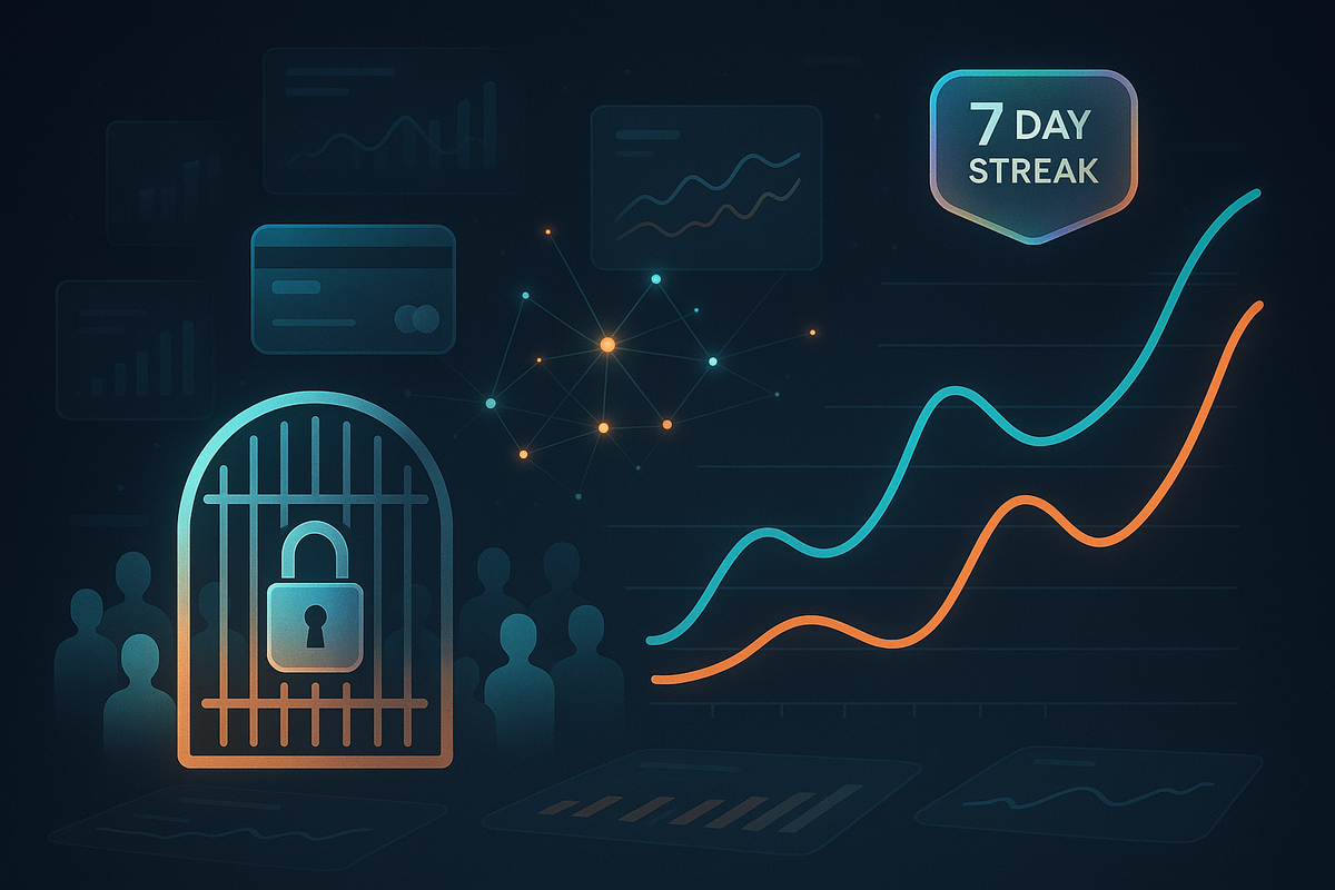
Duolingo's onboarding is the case study everyone cites, and for once the hype is earned. In Growth.Design's teardown of tactics tested across roughly 300 million users, the "Investment Wager" step, where a new user bets on hitting a seven-day streak, lifted Day-7 retention by 14%. Think about what that step actually is. It's friction. It's an extra screen between the user and the lesson. But it's friction that converts a passive intention into a stated commitment, and stated commitments are stickier than silent ones. The screen doesn't slow you down so much as make you complicit in your own habit.
The mechanism generalizes past language apps. Asking a new user to set a goal, name why they're here, or pick a target date is cheap to build and it quietly reframes the relationship. They're no longer sampling your product. They've told you, and themselves, what they came to accomplish. That's also why onboarding questions can lift retention even when they lower completion: the users who answer them have self-selected into caring.
If you want a version to test this week, add one goal-setting step to your onboarding, something the user actively chooses rather than a field they fill in. Then compare Day-7 and Day-30 retention for the cohort that set a goal against the cohort that skipped it. If you don't see at least a few points of separation, the step is decorative and you can cut it. If you do, you've found a lever that costs you almost nothing at the top of the funnel. This is the same reason I keep telling teams that activation rate, not signup rate, is the number the whole funnel should answer to. Friction that raises activation is friction working for you.
Most "friction" teams add is just sludge
Now the honest counterweight, because it would be irresponsible to write a "friction is good, actually" piece without it. The overwhelming majority of friction sitting in real signup flows is not the filtering or committing kind. It's sludge. Extra fields nobody reads, forced account creation before a preview, a plan-selection screen that arrives three steps too early. Research on SaaS onboarding consistently pegs first-30-day abandonment in the 40 to 60% range when the flow is rough, and most of that is self-inflicted drag, not smart screening.
The tell is simple. Ask, for every step in your signup: does this step change who gets through, or does it just make the trip longer? If a step isn't filtering for fit or extracting a commitment, it's a tax, and you should be looking for a reason to keep it rather than a reason to remove it. Progressive disclosure exists for exactly this. Collect what the user needs to complete their first real action, and defer everything else until they've felt the value. The same discipline that makes a landing page convert applies here, and it's worth borrowing the same eye you'd use on the fixes that actually move landing-page conversion.
Every step in your signup flow is either changing who gets through or just making them wait. There is no third category, and most steps are the second one.
And to be fair, this isn't a clean either-or in practice. A step can be part filter, part tax, and the ratio shifts depending on your audience. A phone-number requirement filters spam and commits real users in one product, and repels perfectly good customers in another. The framework tells you what question to ask. It doesn't answer it for you.
A one-week test that won't wreck your numbers
If you want to act on any of this without betting the funnel, run it as a contained experiment rather than a redesign. Pick one candidate friction step. A single qualifying question, a goal-setting screen, or a card requirement on one plan tier, not all of them. Split traffic. Then, and this is the part teams skip, judge it on a retention window, not a signup number. Day-7 and Day-30 retention for the friction cohort versus the control. Signup conversion will almost certainly drop. That's expected and it's not the metric that matters here.
The bar I'd set: the friction earns its place if the retained-user count, not the rate, holds roughly flat or climbs. If you converted 30% fewer signups but the survivors retain well enough that your Day-30 active count is even, you've traded noise for signal at no cost. If retained users fall in absolute terms, you added a tax, and you pull it back out.
My prediction, for what it's worth: over the next couple of years the frictionless-signup orthodoxy softens noticeably, especially anywhere AI has made it trivial to spin up throwaway accounts at scale. When bots can complete your zero-friction signup faster than humans, a little intentional friction stops being a conversion cost and starts being a spam filter. I'd guess a real chunk of B2B products quietly add a qualifying step back in for exactly that reason before 2028.
None of this means friction is good. Most friction is still bad, and the default instinct to strip it out is right more often than it's wrong. It just means the dial has two ends, and the teams that win aren't the ones who crank it all the way down. They're the ones who can tell, step by step, which friction is doing a job and which one is just in the way.
Notice Me Senpai Editorial